UNDERSTANDING THE UNEXPECTED RED THEORY IN INTERIOR DESIGN
No, we are not cueing up taylor swifts red album even with spotify’s 2024 wrap up. We know you are sick of seeing them on your stories. Instead we are exploring the science (promise, no snooze-fest here) behind the Unexpected Red Theory and how you can incorporate this bold hue into your home in a way that feels natural, vibrant, and just cool.

Color theory has always been a key player in interior design, guiding designers to create spaces that are both visually stunning and emotionally engaging. But let’s be real, here in Park City, it feels like everyone is stuck on white, black, cream, grey, and brown! As much as we love a good neutral, we are all about shaking things up. So, as Park City interior designers who love to stand out, we will show you one of our favorite, colorful concepts that breaks the mold and keeps things far from boring. Among the most intriguing of these color theories is the "Unexpected Red Theory," a concept that challenges traditional color palettes and introduces a surprising way to think about using red in interior spaces. Far from the overwhelming or aggressive connotations we often associate with red, this theory suggests that the strategic use of red, particularly in unexpected ways, can evoke balance, warmth, and even joy.

What Is the Unexpected Red Theory?
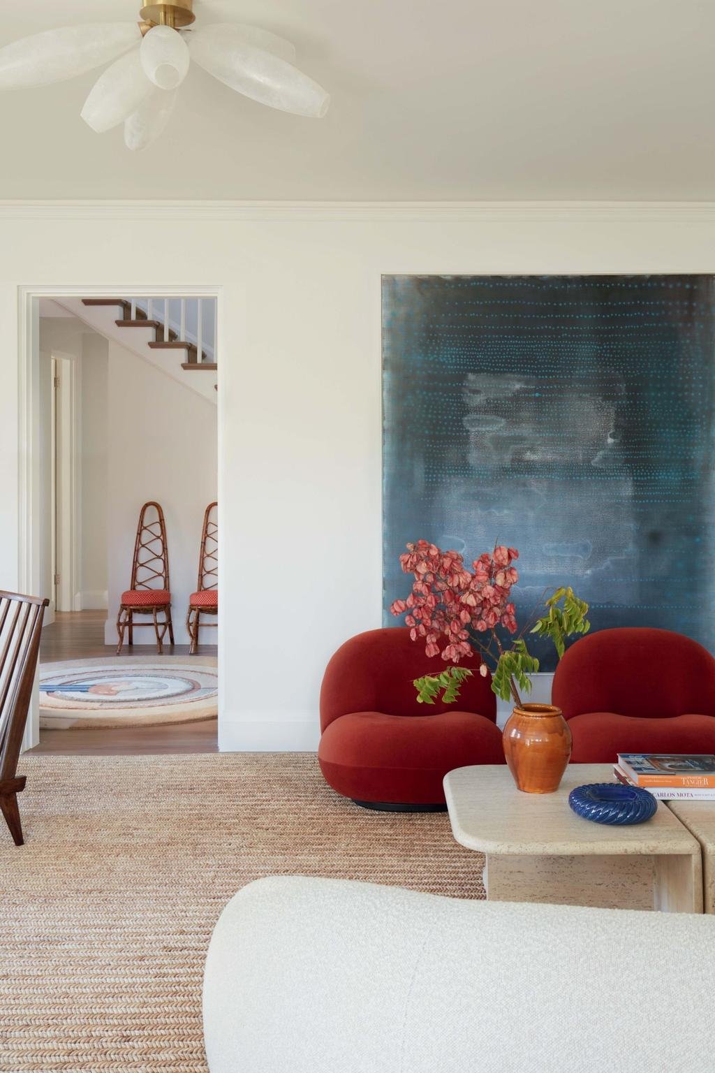
The Unexpected Red Theory stems from the idea that red, typically seen as a color of boldness, intensity, or even danger, can be used in surprising, subtle ways to enrich a space. Instead of applying red in large, dominant areas, this theory suggests using it in smaller, unexpected touches—like a single red accent or an unexpected piece of furniture. By introducing red in these unexpected places, interior designers can bring a fresh energy to a room without overwhelming it. Do not reserve red just for the holidays—that is too basic! You deserve to enjoy this bold hue all year round.
Red has the psychological power to stimulate emotions and elevate a space with warmth, but in this theory, it is all about balance and surprise. For example, a red accent wall might be too much in a calm living room, but a small red chair or artwork can create just the right pop. Red can be fickle so we are here as designers to help! The key is in finding where red works best without clashing with or overpowering other design elements.

The Science Behind Red and Its Emotional Impact
Red has a unique psychological impact on human emotions. It is a color associated with passion, energy, and intensity, but also with feelings of comfort and security when used in moderation. Studies have shown that red can increase heart rate and stimulate a sense of urgency or action. The truth is, color theory is everywhere, subtly shaping our desires and decisions without us even realizing it. It is a wild concept, but also kinda cool. So, next time you are working with an interior designer, remember: they might be influencing your choices in ways you do not even know… and that is a good thing!
In interior design, however, these same properties can be harnessed to create warmth and drama, but they must be carefully controlled to prevent red from becoming overwhelming or making a space feel too stimulating. This is where the Unexpected Red Theory shines—it uses red’s emotional power in controlled, strategic doses, keeping the environment balanced and inviting.

How to Integrate the Unexpected Red Theory Into Your Home
1. Red as an Accent, Not the Focus
Instead of committing to red walls or large-scale furniture pieces, use red in smaller doses. Consider vibrant red accessories, like throw pillows, vases, or a small rug, to add warmth and a burst of energy without overwhelming the senses. A red chair in a neutral-toned room, for example, can serve as a dynamic focal point that catches the eye, adding a sense of playfulness and intrigue.

2. Contrasting with Neutrals
Red pairs beautifully with neutral colors like white, beige, or gray. The neutrality of these colors allows the red to pop, without dominating the room. This is why many designers recommend using red as an accent color in spaces that are primarily neutral. For instance, a white room with a single deep red artwork or a red throw blanket can make a bold yet balanced statement.
3. Playful Red Details
One of the easiest ways to bring the Unexpected Red Theory to life is by using red in playful or unexpected places. Think of a bold red door in an otherwise serene hallway, or a red lampshade paired with minimalist furniture. These subtle touches create an element of surprise, catching the eye without being intrusive.

4. Layering with Other Bold Colors
Red does not have to be used in isolation. In fact, pairing red with other bold colors like mustard yellow, teal, or navy blue can create a lively, eclectic aesthetic. Clearly, we're all about bringing color to Park City! Someone’s got to do it and why not Williams Metcalf Interiors? The key is to maintain balance of colors is by using red in smaller, deliberate doses, and allowing other colors to complement and contrast with it. This technique is perfect for spaces like living rooms, home offices, or even kitchens, where a playful, vibrant energy is desired.

5. Red as a Statement Piece
Instead of painting a whole wall red, a red statement piece like a bright red sofa or an antique red mirror. Heck, we would throw in a wallpaper with red details as part of the design scheme. We not add some extra flair This can add a dramatic flair to a room. These focal points can become the heart of the room, drawing attention and creating a sense of warmth and excitement without overwhelming the entire space. Paired with muted tones or natural wood accents, a red statement piece feels both bold and grounded.

6. Unexpected Red in the Kitchen
In the kitchen, red has long been a favorite color for its ability to stimulate appetite and encourage conversation. We love a good yap over fabrics and design. Does this make us cool for gen z yet? However, the Unexpected Red Theory suggests that this does not have to mean using red on every cabinet or appliance. A red backsplash, red kitchen towels, or even a small red stool can provide the right balance of excitement and energy without making the space feel too intense.

7. Incorporating Red Into Bedrooms
Red in the bedroom can be tricky, as it has the potential to create an overly stimulating environment. Sleep is crucial, and no matter how much you get, it always feels like you could use just a little more except on a powder day. However, when used thoughtfully, red can add a cozy, intimate ambiance. Instead of bright red walls, consider using red in bedding, throw blankets, or decorative accents. A rich burgundy or a deep crimson can evoke a sense of luxury and warmth, creating a calm yet passionate space for relaxation.

The Unexpected Joy of Red in Your Space
Red is not just a color; it is a tool for transformation. The Unexpected Red Theory invites designers and homeowners alike to explore this dynamic color in a way that feels fresh, energizing, and unexpected. We know in Park City, red usually means 'danger' on the ski slopes. As interior designers, we are not scared to use it! In fact, we embrace it to add bold energy and unexpected style to your space. By using red thoughtfully whether in an accent, a statement piece, or a playful detail. You can breathe new life into your home, creating a space that feels both inviting and full of personality.